


A great Dashboard helps you answer critical questions about your revenue, and mitigates risk by helping you surface the red and spot opportunities to win. So what kinds of questions can a Clari help you answer about your pipeline health?
Pipeline Health
- What is our pipeline?
- Are we generating enough pipeline?
- Are we nurturing and progressing the pipeline?
1. What is the pipeline?
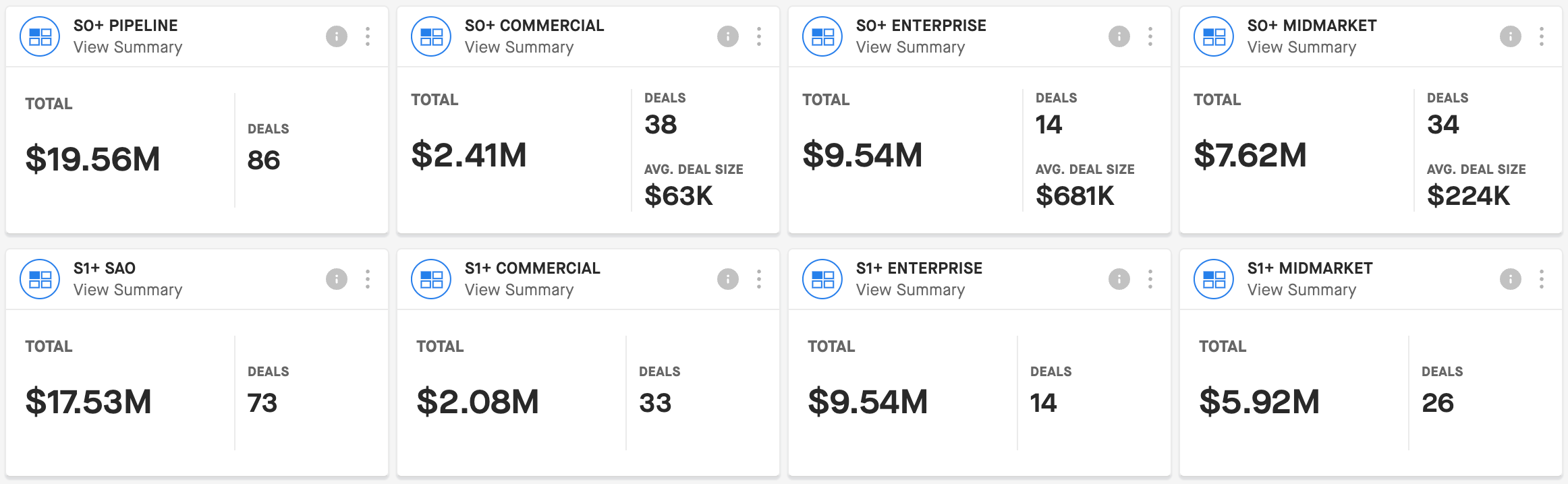
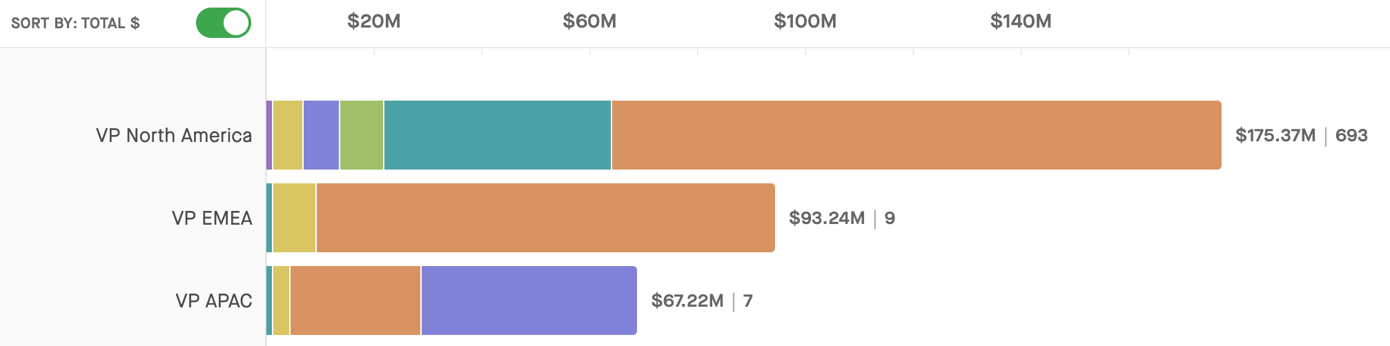
What is the pipeline for CQ / NQ? KPI Widgets pull the aggregate totals from a selected View such as Total Amount, Total # of Deals, and Average Deal Size. I’d suggest you pin KPI Widgets based on the following Views to your Dashboard:
- CQ Pipeline
- NQ Pipeline
NOTE: The Views might be called something slightly different in your Clari instance depending on what you named them.
You can break these down further as you see fit, according to your Views. Generally, the business segments that you consider important enough to create special Views for are probably the same ones that you want to see in your Dashboard, whether you break it down by product, region, or any other business segments.
Example (in this example, pipeline views are broken down by stage):
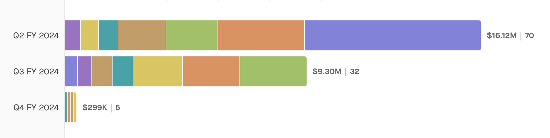
Follow-Up Question: What is the pipeline composition?
Is your pipeline composition healthy? Chart Widgets are excellent at helping you to visualize your pipeline by key characteristics. You could create some Charts in the Opportunities Module from your CQ Pipeline View, and group them by the groups below:
- CQ Pipeline Grouped by (1) Close Date and (2) Stage (or Forecast Category)
- CQ Pipeline Grouped by (1) Close Date and (2) Product
- CQ Pipeline Grouped by (1) Owner (Hierarchy Mode) and (2) Close Date
This will help you start to understand if you have a healthy pipeline mix, and verify that all the different areas of your business are set up for success. You don’t want to see unexpectedly low pipeline for a key product or a strategic region, for example.
Example:
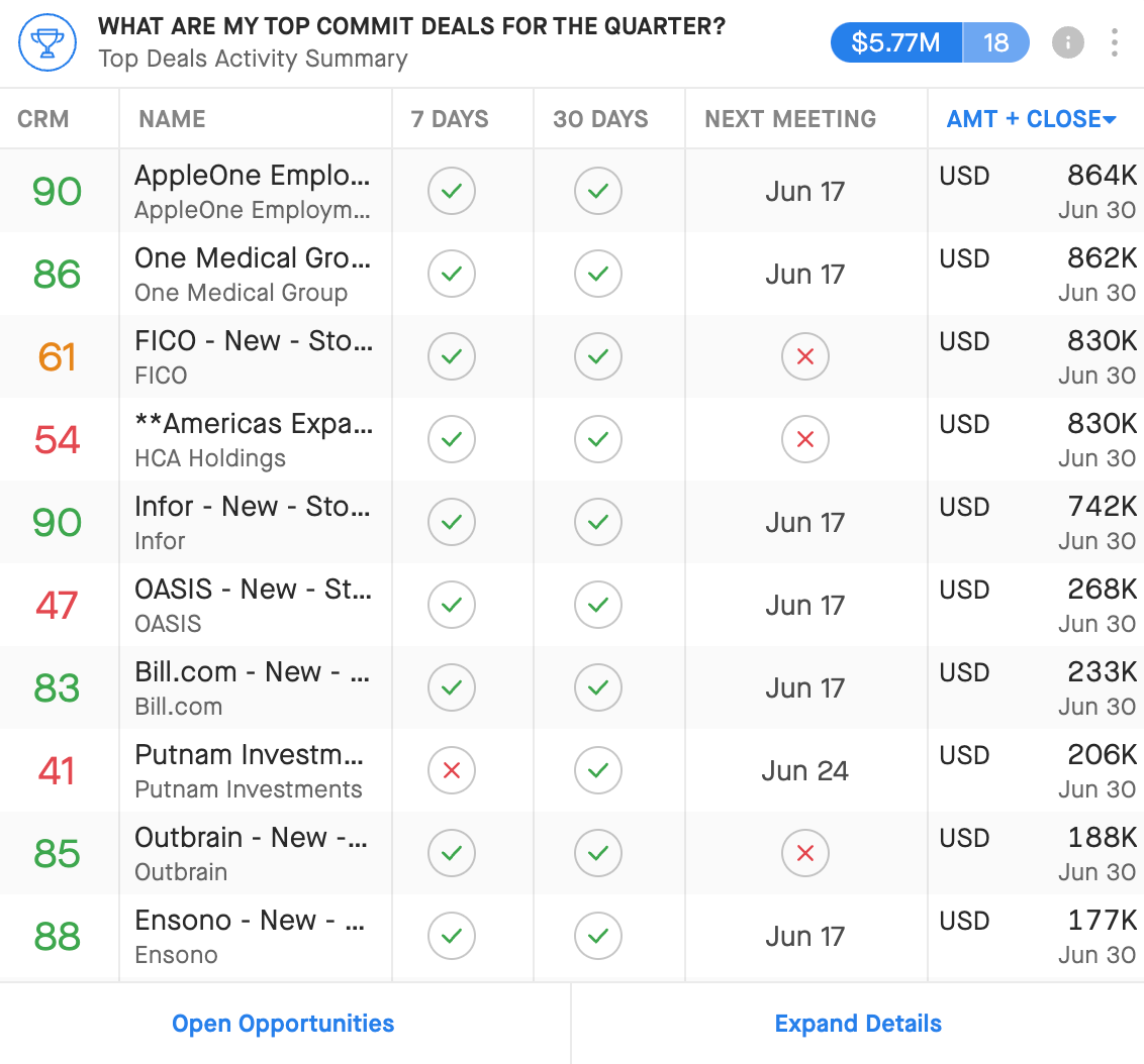
This might also be a good place to pin 1 or 2 Top Deals Widgets from Views that show you your most strategic deals. This can help you keep an eye on the top 10 deals in important business segments to ensure they are progressing towards closed-won.
Example:
2. Are we generating enough (quality) pipeline?
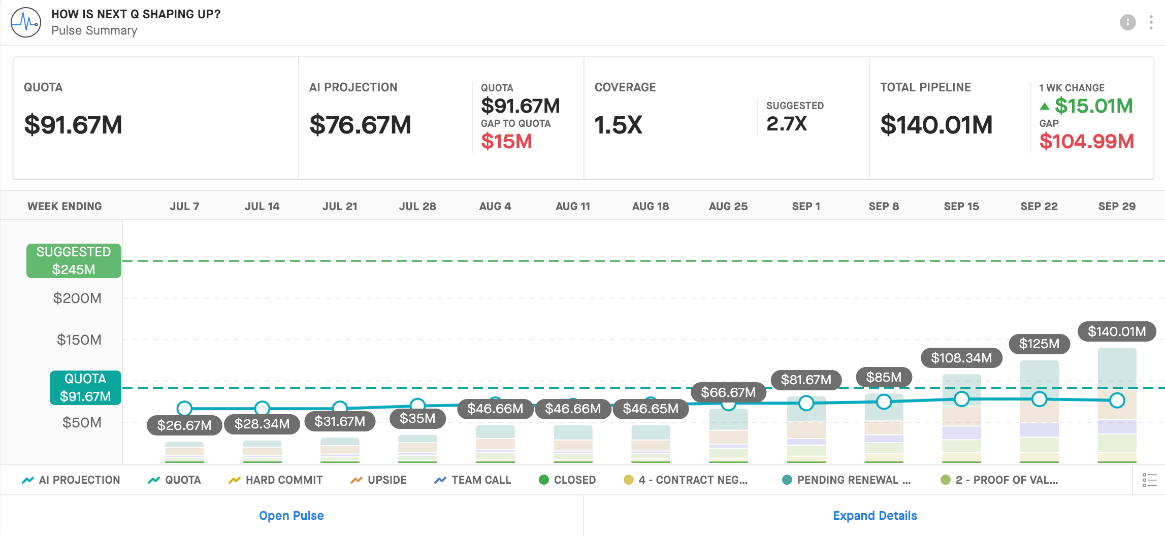
You can use a combination of Clari’s Pulse and Opportunities Modules to understand if you are building enough pipeline, and if the mix of that pipeline is such that you are setting up your teams for success next quarter (NQ)
Pin the Pulse Widget from NQ Pulse to view Clari’s suggested total pipeline amount at the beginning of NQ. This is based on your historical performance and the quota you have entered for NQ. Clari will suggest not only a total amount for your overall pipeline, but how that amount should break down across your forecast categories and/or stages at the beginning of the quarter.
- NQ Pulse
Example:
You can then use a few more Chart Widgets to view your pipeline mix across other important variables. Simply use a View that shows you quarter-to-date pipeline generation and group by fields such as the following:
- Lead Source
- Close Date
- Product
- Owner (Hierarchy Mode)
Example:
3. Are we nurturing and progressing the pipeline?
There are a number of modules in Clari than can help you understand where deals tend to drop off or stall out, which deals you should be spending more time on (and perhaps which ones you should not), how deals move through your sales process, and if you’re spending time with the right accounts.
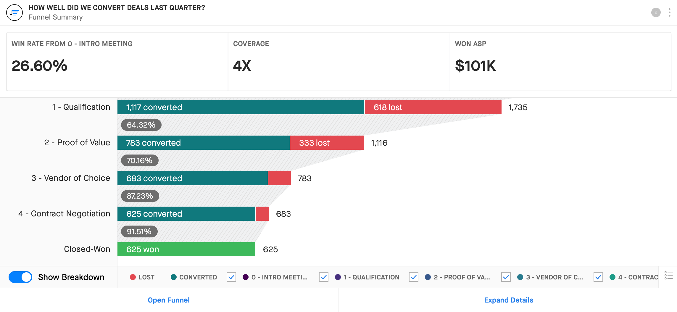
Funnel
Funnel allows you to visualize how pipeline is converting through your stages (or a different breakdown field, like forecast categories). Pin this visualization and the insights that come with it to your Dashboard with a Funnel Widget. In this case, you can look at the funnel from the past 2 quarters to get a sense of when deals tend to drop off, and assess what you can do to address that trend,
- Last Quarter (LQ) Funnel Widget
- 2 Quarters Ago Funnel Widget
Examples:
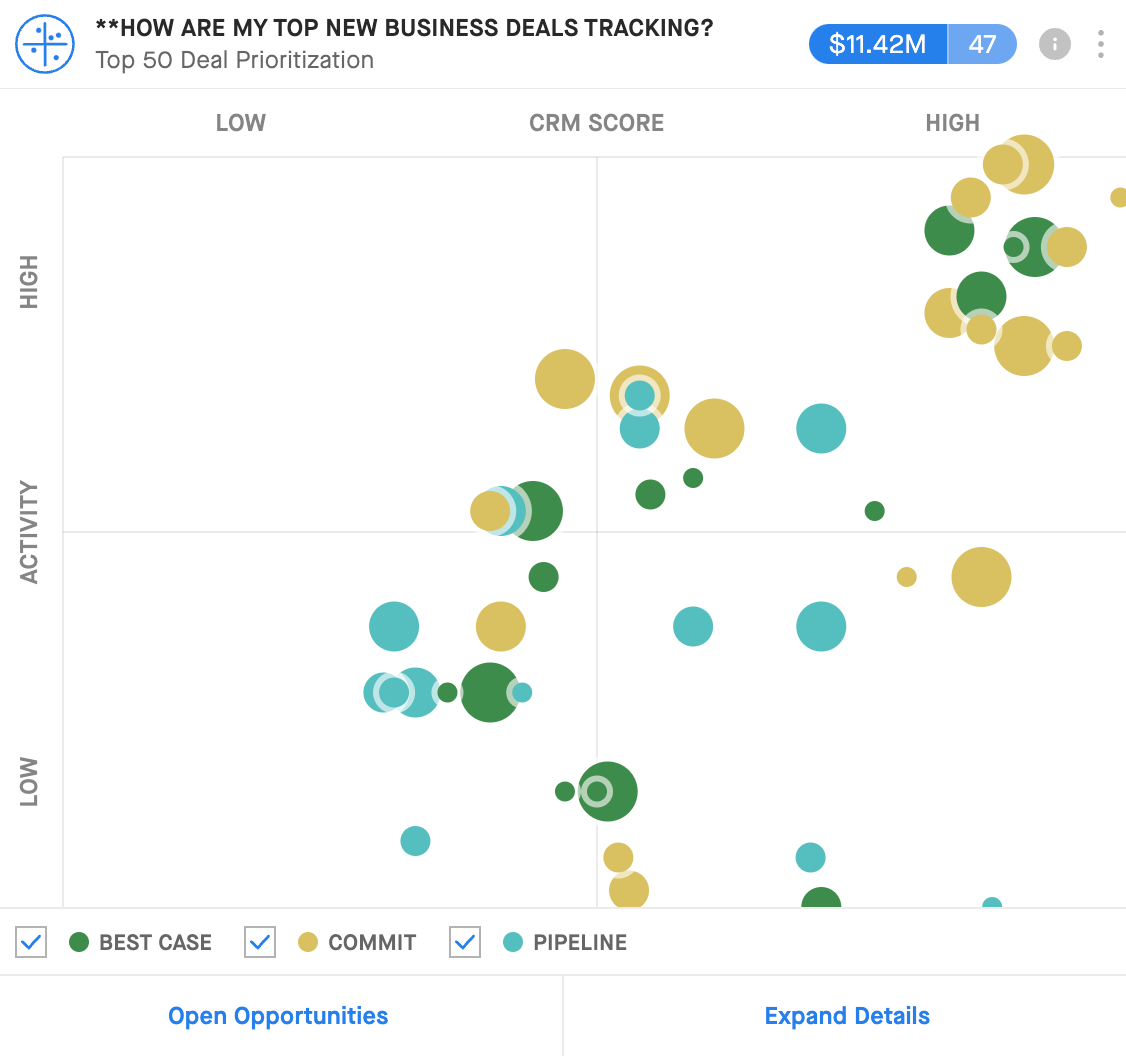
Opportunities
- Are we wasting our time? (Deal Prioritization Widget for CQ Pipeline)
- Where are we stalled out? (Chart Widget grouped by Stage and Stage Duration or Deal Age—if you have a field for something like that in CRM)
Examples:
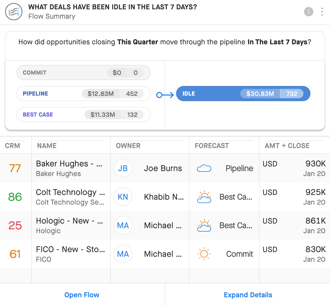
Flow
Flow lets you visualize pipeline movement over a set time frame, including deals that have remained idle (or upgraded, or downgraded) through your sales cycle. The Flow Widget allows you to focus on a specific start state or end state. So you can look at things like how deals closing this quarter that started in a specific stage moved through your pipeline in the last 7 days (i.e. did they remain idle, did the progress/”upgrade”, or did they regress/”downgrade”?), or where the deals that remained idle this past week came from (are a lot of them sitting stuck in one stage in particular?).
- How are deals moving through our stages? (CQ Flow & NQ Flow Widgets)
Example:
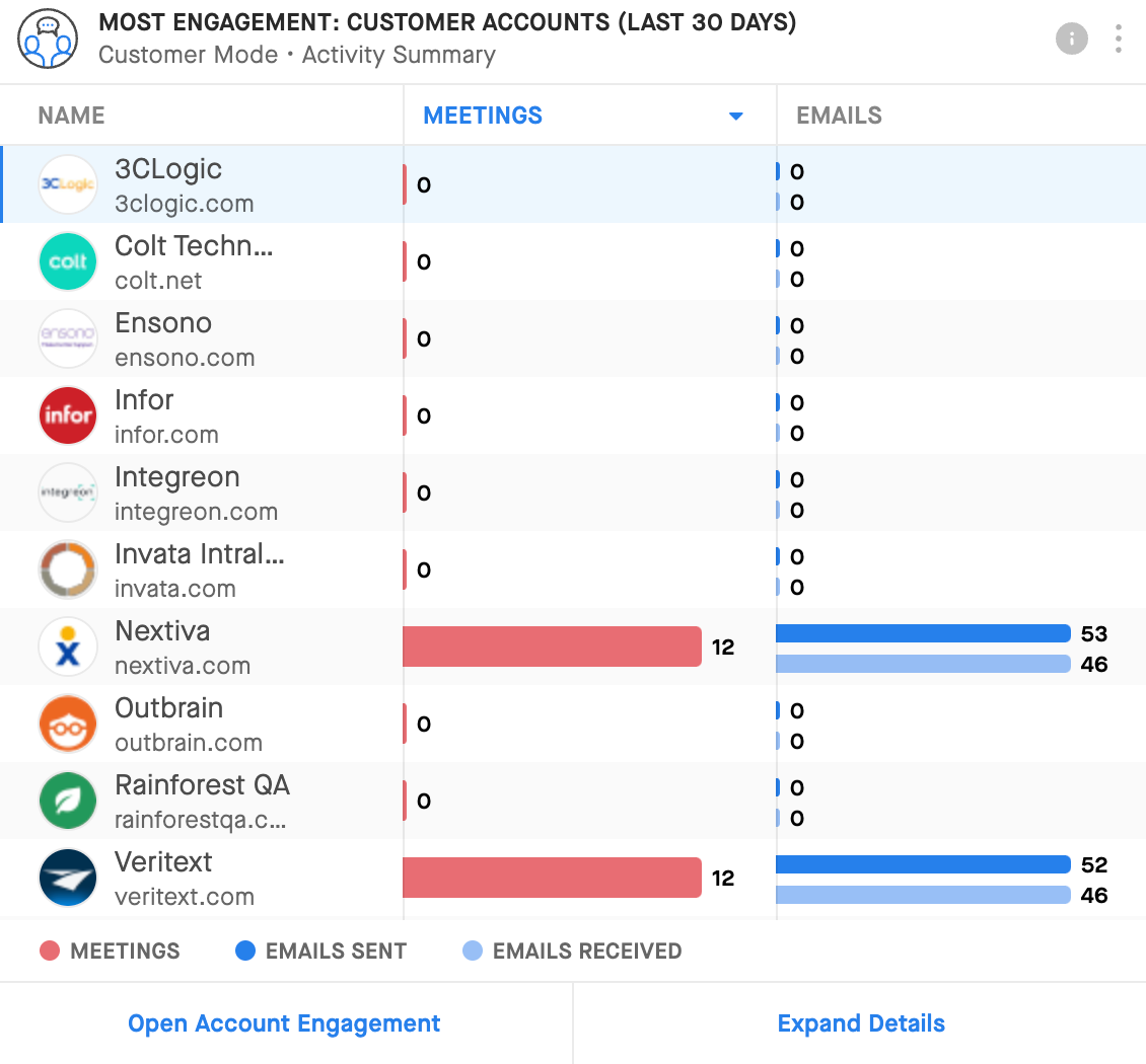
Accounts
The Accounts Widget allows you to instantly view the accounts with which you are spending the most time and assess if they are the right ones based on the opportunities that you have with them.
- Where are we spending our time? Are we spending our time with the right accounts? (Accounts Widget)
Example:
NOTE: See the Pipeline Health Dashboard Guide (attached) for more examples of widgets you can use to build the pipeline health dashboard that works best for your team(s).