
Best use cases for Groups/Charts? (mine are Slipped Deals and Churn Review)

  • September 15, 2022
  • 7 replies
  • 187 views

kstanforth
Clari
Forum|alt.badge.img+4

Curious to know how you all use groups and charts in Clari! Would love to set up some best practice guides for your top use cases. 

To start off this discussion, my own is actually from working in Sales Ops when I was a Clari customer: slipped deal reviews (but churn reviews is a close second from my time on CS Ops 😉).

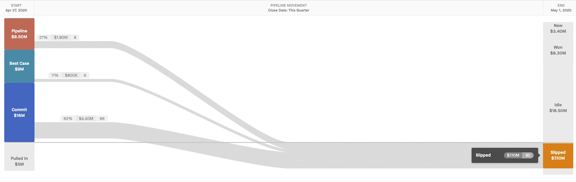
My workflow: at EOQ I’d look at the last 2 weeks in Flow (you could also do this in Waterfall now!), click into the Slipped bucket, then try a few things out:

  1. Group by Owner and hierarchy- so I could see who my problem children were/which regions had deals slip in the last 2 weeks of the qtr 🤦🏻
  2. Group by Close Date- to see if everything just got pushed to the last day of the NQ or EOY meaning it might not have been evaluated if it was viable/should be closed lost 🙄. These were the deals I did closer inspection on.
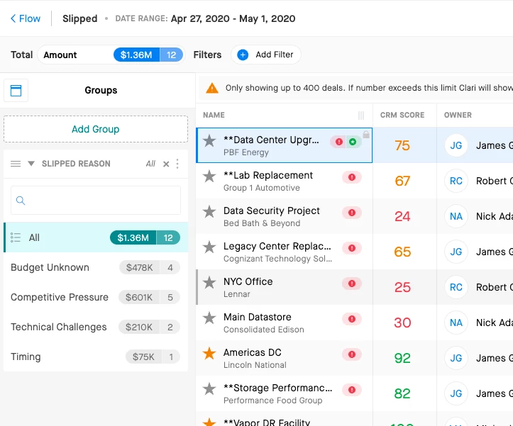
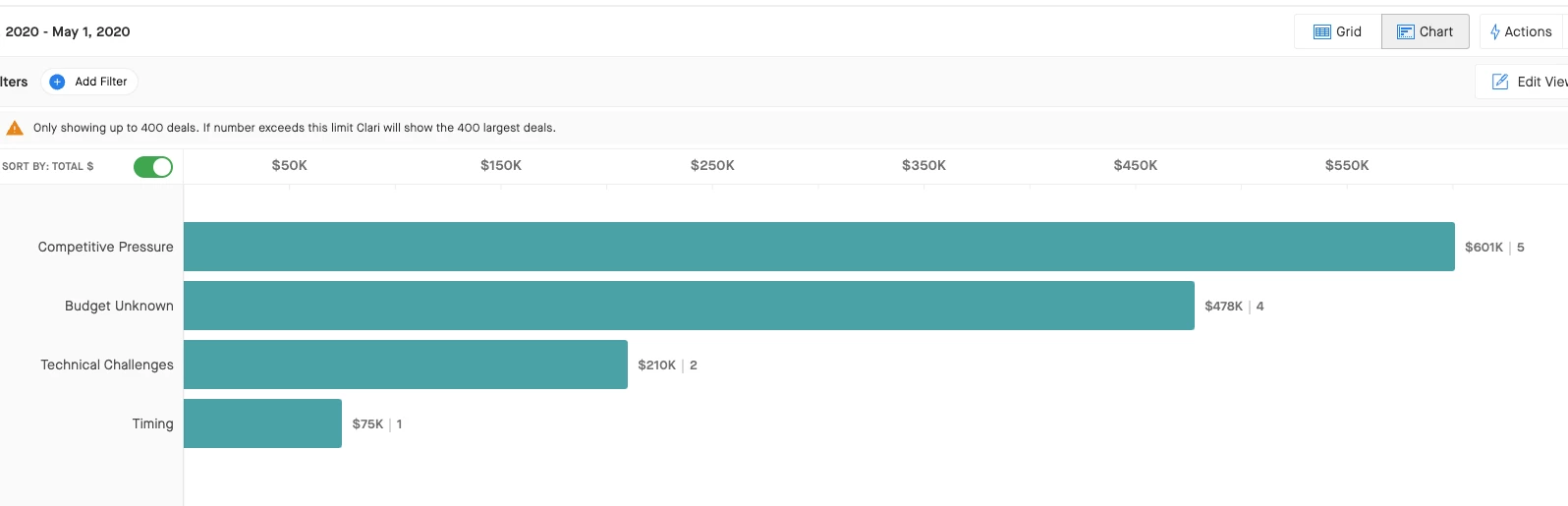
  3. Group by Slipped Reason - to see trends in WHY things slipped and find areas we might need more enablement on 👀


Looking at these groupings in Chart View made it way more efficient to visualize trends and share my findings with others (particularly Sales Leaders on our start of Q forecast calls, where we had wider slipped deal reviews).

What about you all? Any other interesting workflows you use groups and charts for? 1:1s? Forecast inspection? Other folks use it for slipped reviews, too? 

7 replies

jessica_starr
Clari
Forum|alt.badge.img+1

Such a powerful use case! In my CS Ops days I would look at all of our open renewals and group by close date and account health and go into chart mode. It was super powerful to visualize where in the year we had the biggest $$ of renewal risk. 


  • Engaged Member
  • September 20, 2022

Most of our chart use ends up on operational day-day dashboards…….open/closed business groupings by team, week to week forecast trend, pipeline movement as we move through the Qtr…...however we (Ops) do also use alot of grouping/charts at Qtr end and QBR time, Mostly to look at slipped opps, opps lost at early stage. More and more use cases will come through as we scale up the business….forecast category movements, renewal due dates, renewals at risk.

AE’s and MGR’s are the ones that tend to take screen grabs of the charts/graphs and groupings for their QBR presentations with additional detail they can talk to either live on screen or in the deck. 

I have noticed over the past 6 months that the teams are using these more and more for presentations, pipeline reviews and QBR’s as they find it easy to present the graphic to their audience and then provide the detail behind it. Its much more appealing to the eye to grab the crowd and shows at ease what they are trying to get to quickly. 


kstanforth
Clari
Forum|alt.badge.img+4
  • Author
  • Clari
  • September 20, 2022

Thanks for the insights, @Andy Smidmore!  Love all of the use cases, particularly around QBRs. Do you typically do a QBR dashboard or is it primarily the screenshots?

Agree wholeheartedly with the value of presenting it and then digging into the detail behind it.  We’ve been doing more of that here when we don’t need to build a full dashboard for an internal call.

^ Ex. I’ve run team Churn Reviews out of the Opps module in Groups/Charts to visualize the categories and reasons we’re seeing the most, and then, depending on audience, diving into the specific deals and notes the team has filled out in fields with color commentary.  Been a huge timesaver and a great way to teach folks how to fish using groups/charts if they want to dig into those insights for themselves. 


  • Engaged Member
  • September 22, 2022

Hey Katie - We built QBR dashboards out (1 for AE Presentations and 1 for Sales MGRS). Both pretty much feature the same metrics with some differences such as the Mgr DB Splitting ramped vs ramping AE’s in some widgets and some other KPI’s that not all AE’s need to have access to. We have used them in 2 x Qtr QBR’s now and evolve slightly every qtr but have added huge value to the QBR pres. 


NicoleA
Engaged Member
Forum|alt.badge.img
  • Engaged Member
  • September 23, 2022

Great question!  As a CS leader, I like using the groupings and charts in the Opportunity Grid to get quick answers to big questions.  My 3rd week on the job, I was able to quickly put together a presentation regarding the staffing levels on our CSM team by creating and taking screen shots of graphs of things like:

  • How many red/yellow health renewals are coming up Quarter by Quarter
  • How many Accounts / How much ARR does each region support
  • How many new customers are in the pipeline/commit by region

Having the ability to drill into those helped me to learn the business quite quickly so I could have confidence in stating my position on our staffing needs.


Eric Chappell
Engaged Member
  • Engaged Member
  • April 14, 2023

@Jackie D'Ingianni Great discussion on leveraging Clari functionality for slipped deals and churn.


David Ogborn
Esteemed Contributor
Forum|alt.badge.img+8
  • Esteemed Contributor
  • April 20, 2023

@Don Hah - This may be an area we review during upcoming enablement to ensure the team is comfortable managing large quantities of deals and navigating to find the most pertinent information