


With the warming 🌞 temperatures recently, it only felt natural to share how Clari’s AI projection continues to be a HOT 🔥topic.
But first, here’s a terrible, but related joke before we dive right in to the important stuff.
Q: Why did the cartographer increase the temperature of the room?
A: To draw a Heat Map!
AI PROJECTION HEAT-MAPPING:
We all know Clari’s AI Projection helps sales teams understand where it projects you’ll land in the quarter based on your historical conversion rates the past 4 quarters. Creating an AI projection “heat-map” can help you visualize projection trends and spot when in the quarter the AI projection starts to become more ‘accurate’ (lime and green colors) and what weeks typically experience the least amount of projection accuracy (yellow and red colors).
Every business is unique so it’s hard to provide a one-size fits all approach in explaining the trends you may be seeing. But as we all know, garbage data in = garbage data out . Your reps play a pivotal role in maintaining CRM hygiene to ensure Clari is using accurate and updated data to calculate the projection. (Also make sure you’re applying all the right analytics filters and have selected the right “scope”).
How to Create a Clari AI Projection Heat Map using a Spreadsheet like GSheets or MS Excel:
- Open Clari PULSE and apply the necessary filters and hierarchy selection (e.g. Opportunity Type=[New Business], select Scope=[CRO])
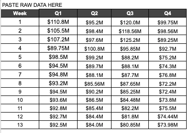
- For each of the past 4 quarters, copy the weekly AI Projection values in “Grid View” (top right corner icon) and paste the values onto your preferred spreadsheet platform as separate columns. You’ll notice copy/pasting Pulse values will transpose the rows into columns:
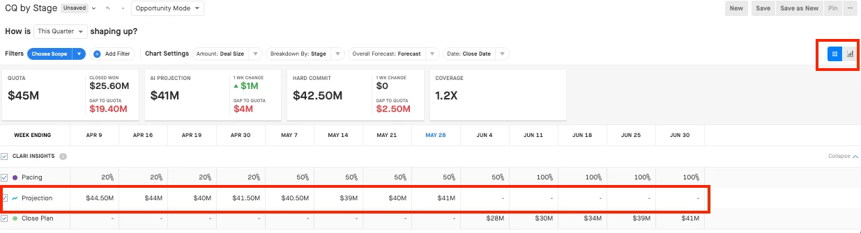
- Remove the “M” (millions) by creating a formula (=SUBSTITUTE([Cell],"M"," "))
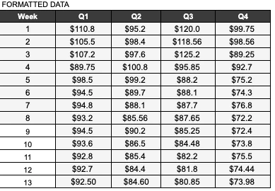
Note: If you have numbers <$1M, you’ll have to express the number manually as a fraction (e.g. $857K = $0.857M)

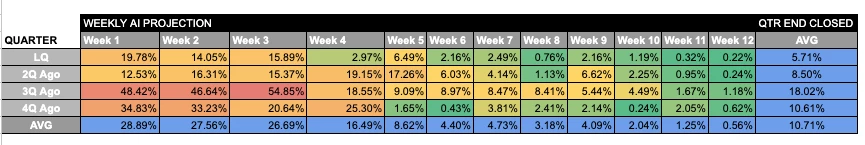
- Create a 12 week table with formula (=abs(sum(([Week13 value]-[Q1 Week 1])/[Week 13 value))) and format the rows as percentages. Apply the formula to the other cells. Week 13 is the last week of the quarter, which we ommit in the table, but we use that value as the final closed won amount as part of the calculation.
- Apply “Conditional formatting” that applies a relative color gradient to the table in step #4:
(Scroll the bottom on how to create a Heat-map using GSheets)
I probably left out some sub steps since I’m not an Excel guru, but I used basic formulas and simple arithmetic. Spreadsheet masters can definitely find a faster and more simpler way of visualizing this. If so, comment below and share your ideas!
What Insights Can I gather from this?
Using the screenshot above:
- During the first 3-5 weeks of the quarter, the AI projection is the least accurate or has the most variance. This could be due to reps not maintaining CRM hygiene earlier in the quarter and not progressing deals through the funnel consistently. Great opportunity to create a CRM hygiene dashboard.
- We start to see a lot of ‘green’ and more accurate percentages (closer to 0%) during mid-late quarter. Typically we see this trend as reps have a firmer grasp of the trajectory of their deals, especially the last few weeks of the quarter.
These are just some example insights, though a more comprehensive analysis will require aid from the other analytics modules as well as knowing business-related factors to truly understand the story behind the numbers. Did something major happen 3Q ago when the AI projection was way off? Perhaps you recently experienced change-management or you acquired another company and had a large influx of deals migrate into your existing SFDC causing projection spikes. Maybe your business was impacted my macro economic or industry-related events?
Regardless, we encourage you to go beyond the surface and go behind the scenes to understand where you can mitigate risk and forecast more accurately. Remember, the AI projection serves as a data point and is not a crystal ball :) 🔮 though there are ways you can help influence the projection to consistently be accurate.
Reach out to your CSM on how you can get a personalized Revenue Precision Insight analysis applied to your data and comment below on any questions/thoughts!
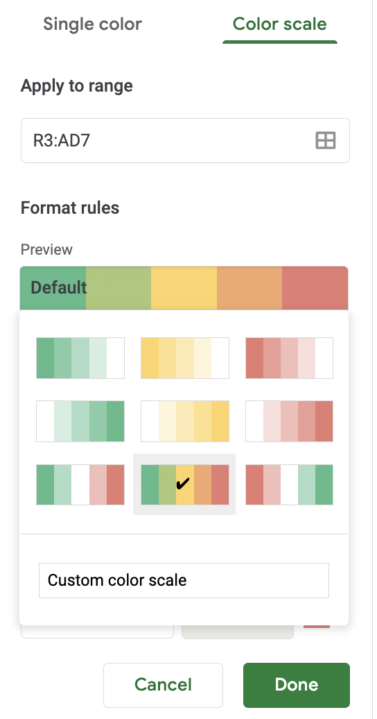
How to create a heat-map using GSheets:
Select values from top left to bottom right cells (not including row/column headers and averages)
-
Format → Conditional Formatting → Click “Color Scale”
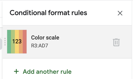
- Click the color gradient box and select the desired color gradient
Related Resources:
How to Interpret the Clari Projection